Machine learning: k-means algorithm
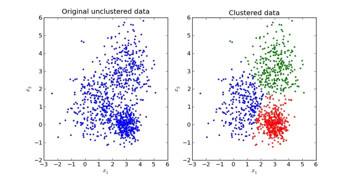
A popular clustering algorithm is K-means, It’s a unsupervised method that divides data-points in predetermined k groups. This algorithm starts k centroids randomly.
For instance, if you have samples of venom glands from a differential gene expression experiment k will be hypothetical samples; if you work with cancer samples the initial centroids will be hypothetical patients and so on. Then each sample is assigned to the closest centroid in multiple iterations.
It important highlight that the initial centroids are chosen randomly, so the results may differ. This is its biggest disadvantage.
In this example, we have multiple types of cancer and we are going to try to cluster the samples and review if they match with the original designation (if you want more information about the dataset and the methods I recommend you reading Alatuna Akanin Computational genomic with R book).
First, we have to import the data, you can download the data here:
Download example data
Or use the original source installing the package compGenomRData
library(cluster)
library(ggplot2)
library(ggpubr)

mat <- read.csv("~/Documentos/R/R_personal_website_2.0/static/uploads/leukemiaExpressionSubset.csv")
rownames(mat) <- mat$X
mat <- mat[,2:ncol(mat)] |> as.matrix()
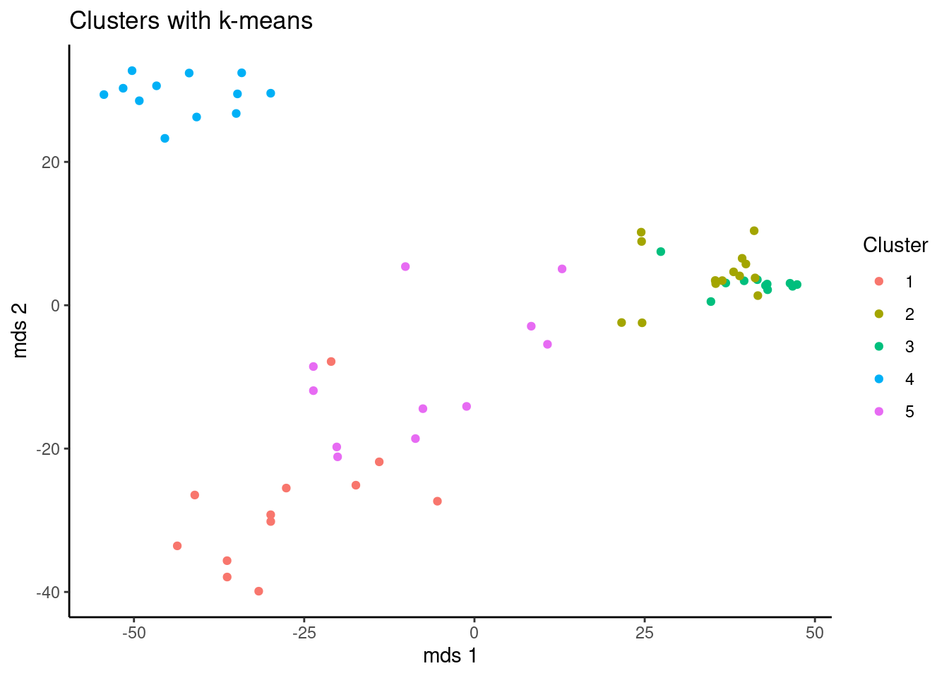
Then we make a k-means clustering using the cluster package with the function kmeans(), as it was said before, the initial centroids are selected randomly, that’s why we use set.seed() to use always the same pseudo-random numbers.
The number of cluster are arbitrary, in this case we use 5 and we create the object kclu, inside this object, kclu$custer contain the samples and the custer each of them belong. Finally, we use table() to summarize the results.
set.seed(101)
kclu=kmeans(t(mat),centers=5)

type2kclu = data.frame(LeukemiaType =substr(colnames(mat),1,3),
                       cluster=kclu$cluster)
table(type2kclu)
| LeukemiaType | cluster | Freq |
|---|---|---|
| ALL | 1 | 12 |
| AML | 1 | 0 |
| CLL | 1 | 0 |
| CML | 1 | 0 |
| NoL | 1 | 0 |
| ALL | 2 | 0 |
| AML | 2 | 1 |
| CLL | 2 | 0 |
| CML | 2 | 1 |
| NoL | 2 | 12 |
| ALL | 3 | 0 |
| AML | 3 | 0 |
| CLL | 3 | 0 |
| CML | 3 | 11 |
| NoL | 3 | 0 |
| ALL | 4 | 0 |
| AML | 4 | 0 |
| CLL | 4 | 12 |
| CML | 4 | 0 |
| NoL | 4 | 0 |
| ALL | 5 | 0 |
| AML | 5 | 11 |
| CLL | 5 | 0 |
| CML | 5 | 0 |
| NoL | 5 | 0 |
K-meoids
Other approach to cluster samples with unsupervised machine learning is K-meoids, it is similar to k-means but it takes real data points instead hypothetical centroids and it use Manhattan distance in each iteration.
kmclu=cluster::pam(t(mat),k=5,metric = "manhattan") # cluster using k-medoids
# make a data frame with Leukemia type and cluster id
type2kmclu = data.frame(LeukemiaType=substr(colnames(mat),1,3),
                        cluster=kmclu$cluster)
table(type2kmclu)
| LeukemiaType | cluster | Freq |
|---|---|---|
| ALL | 1 | 12 |
| AML | 1 | 0 |
| CLL | 1 | 0 |
| CML | 1 | 0 |
| NoL | 1 | 0 |
| ALL | 2 | 0 |
| AML | 2 | 10 |
| CLL | 2 | 0 |
| CML | 2 | 0 |
| NoL | 2 | 0 |
| ALL | 3 | 0 |
| AML | 3 | 2 |
| CLL | 3 | 0 |
| CML | 3 | 0 |
| NoL | 3 | 12 |
| ALL | 4 | 0 |
| AML | 4 | 0 |
| CLL | 4 | 12 |
| CML | 4 | 0 |
| NoL | 4 | 0 |
| ALL | 5 | 0 |
| AML | 5 | 0 |
| CLL | 5 | 0 |
| CML | 5 | 12 |
| NoL | 5 | 0 |
Visualizing results with ggplot
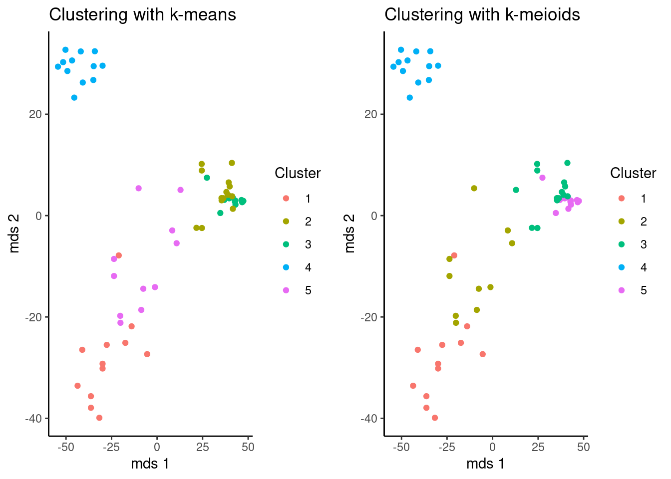
You can use different tools from or pythonto vizualize the results. In this case, a function to print two plots together was made. But Remember, the name of the cluster is random, so both algorithms are consistent even if the name of the cluster are not the same, in this cases it’s better compare the previous tables.
# Calculate distances
dists=dist(t(mat))
# calculate MDS
mds=cmdscale(dists)
ggplot(data = as.data.frame(mds),
       aes(x = V1,y=V2, color = as.factor(kclu$cluster))) +
        geom_point() +
        theme_classic()+
        xlab("mds 1")+
        ylab("mds 2")+
        scale_color_discrete(name = "Cluster")+
        ggtitle("Clusters with k-means")
km_plot <- function(m,k) {
        p <- ggplot(data = as.data.frame(m),
               aes(x = V1,y=V2, color = as.factor(k$cluster))) +
                geom_point() +
                theme_classic()+
                xlab("mds 1")+
                ylab("mds 2")+
                scale_color_discrete(name = "Cluster")
        if (class(k)== "kmeans" && length(class(k) == 1)) {
                p <- p + ggtitle("Clustering with k-means")
        }else {
                p <- p + ggtitle("Clustering with k-meioids")
        }
return(p)
}
ggarrange(km_plot(mds,kclu),km_plot(mds,kmclu))
Do I choose the correct number of custer?
As I said before, the number of Ks is selected completely arbitrary by the data scientist or researcher. Is there some criteria to choose the best number of Ks?.
Yes. There are different aproacches.
Silhouette
Silhouette metric can take values from -1 to +1 negative values indicate that you can trust on that assignation and positive values mean that the point is well matched.
This metric compare how similar is a point to its own cluster and how different is its to other clusters, that implies that silhouette values are calculated to each point.
Here we test if 5 is a “good” number of Ks.
pamclu=cluster::pam(t(mat),k=5)
plot(cluster::silhouette(pamclu),main=NULL)
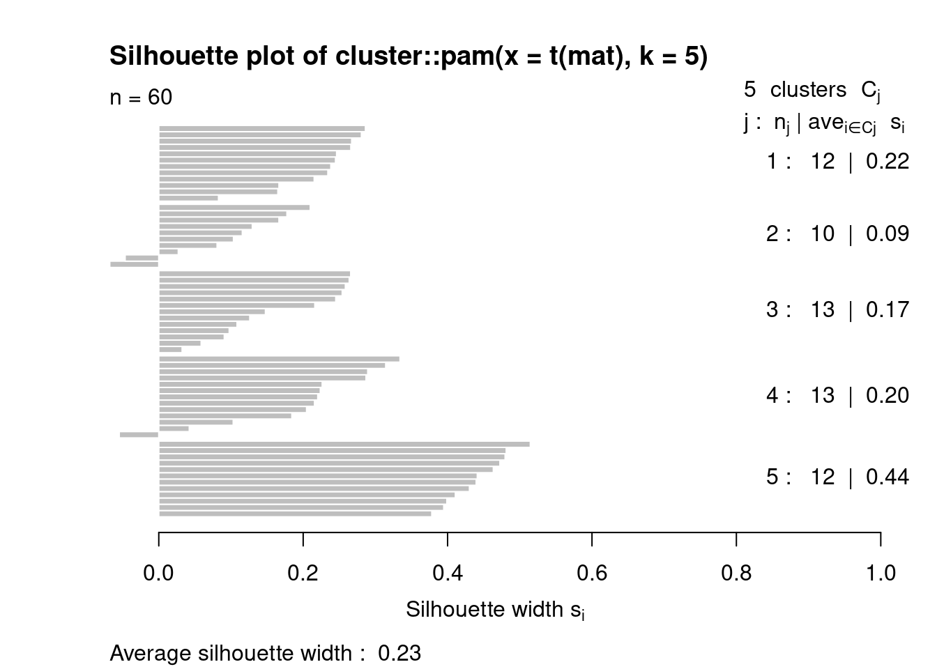
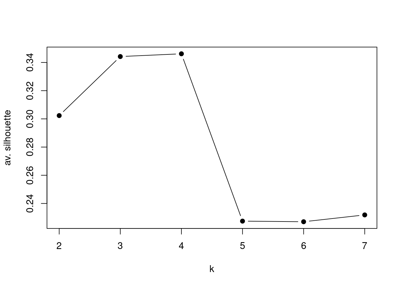
Here we compare the average of silhouettes for multiple Ks number, and the algorithm shows best result using a k = 4, but remember, this cluster does not have meaning by themselves, you have to know you data and understand the problem you are facing.
Ks=sapply(2:7,function(i)summary(silhouette(pam(t(mat),k=i)))$avg.width)
plot(2:7,Ks,xlab="k",ylab="av. silhouette",type="b",
pch=19)
